︎︎︎ Back to Projects
MYCS Product Details
Re-design
During my time at MYCS we redesigned our product details for a shorter consideration phase leading to more knowledgeable and relatable product purchases.
Client: MYCS
Work: Information architecture, UX/UI Design, Interaction Design, User Testing
Work: Information architecture, UX/UI Design, Interaction Design, User Testing
Team: Lyaysan Biktimirova, Valentin Minkov, Simas Aleksiejunas, Jody Ridho Rachmano
Content: Adam Thorogood, Michal Kubacki, René Natzel, Camille Perrret, Elise LeBrun, Christian Röder, Dario Zaugg
Our website visitors were often missing important information about their product. They felt the details we were showing in our product pages were insufficient which was leading them to call the customer care team to have to answer questions that could be already answered at an earlier stage online.
At the same time our brand team felt the website was missing useful and eye-catching content.
We decided it was a good opportunity to re-design the way we showed product details and features on our product pages and on our configurator pages.
We decided it was a good opportunity to re-design the way we showed product details and features on our product pages and on our configurator pages.
Table of contents
Motivation & background︎︎︎
Research & Ideation︎︎︎
Proposal︎︎︎
Testing︎︎︎
Final design︎︎︎
Motivation & background
Missing information
By talking with interior designers and customer care part of our team collected research and insights on what were the main informations and USPs from each product category. This research enabled me to find that there was a lot of information that was important to customers and users in the consideration phase that was missing from our current product descriptions.
Not only was there information missing but sometimes shown in ways that are hard to understand. For example information often is inserted in long paragraphs that are hard to scan when maybe you want to find just one small piece of information. Every time we would add new features into our existing details component on our configurators, we add to the cognitive load that users have to go through. How do they know what information is relevant to them?
Consistency (or lack of)
Currently the product details and features that we show are different in our product pages than they are under our configurators. Often providing totally different experiences of information for those users that land directly on product pages, from those that land on our configurators as their product page. This also means we are maintaining different components for those pages that in theory have the same purpose.
Scalability
More than a motivation, something that we needed to make sure the re-design project achieved as a goal, by creating clearer information groups, adding information would be easy to do but also that it could work across product categories so we wouldn’t fall into the same issues as before of creating new components for very particular instances.
All these problematics meant there was an opportunity to provide a better experience for our online shoppers by integrating more relevant information on our product pages.
How might we design clearer, intuitive and scalable ways to show our product details to our online visitors, reducing doubts in their consideration phase?
Research & Ideation
As a proof of concept we as a group decided to scope the project to our biggest selling product categories: sofas and shelves.
I decided to take a look at our competitors to gain insights on what they were doing well and possibly find missed opportunities in our product details. View presentation here︎︎︎
After looking at our competitors and how they show their details, these were the main takeaways:
-
Information that are hard facts are often communicated in short and easily scannable text.
- Most competitors are supporting technical information with video and photographic content that brings an emotional aspect, as well as give a more realistic impression of features and materiality of their products.
- Dimensions are displayed visually with graphic aids are incredibly helpful in addition to having them in the hard facts information.
From looking at the insights from the issues brought by our CC team and at the way our competitors communicate I drafted out a new proposal information architecture for such descriptions and features color coding those that we did communicate at the moment and those that were missing.
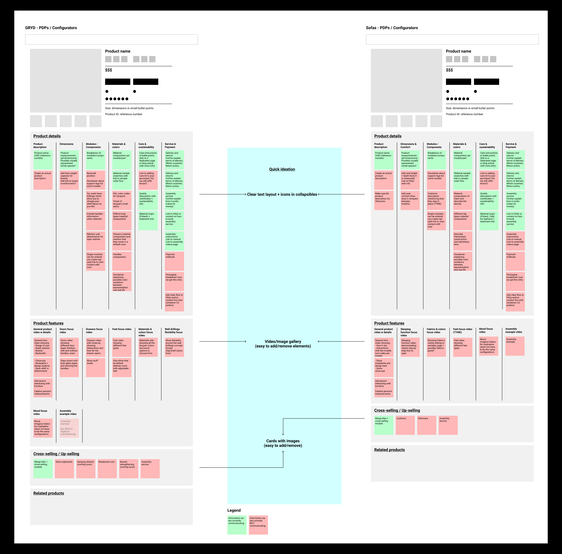
In this new information structure hard facts are communicated by easily scannable short texts, and images or videos are key points of showcasing our quality and value of our features.
Proposal
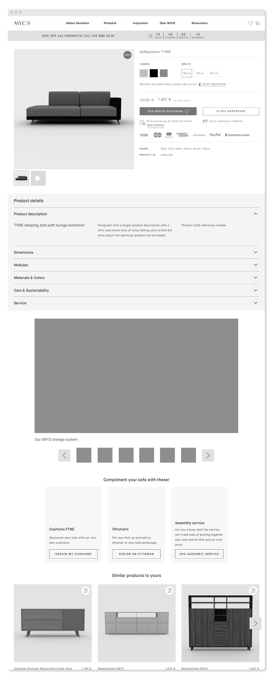
From that structure I went through several iterations of design that after feedback rounds ended in the design I then user tested with placeholder content for our sofas.
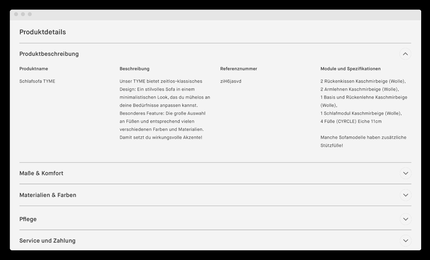
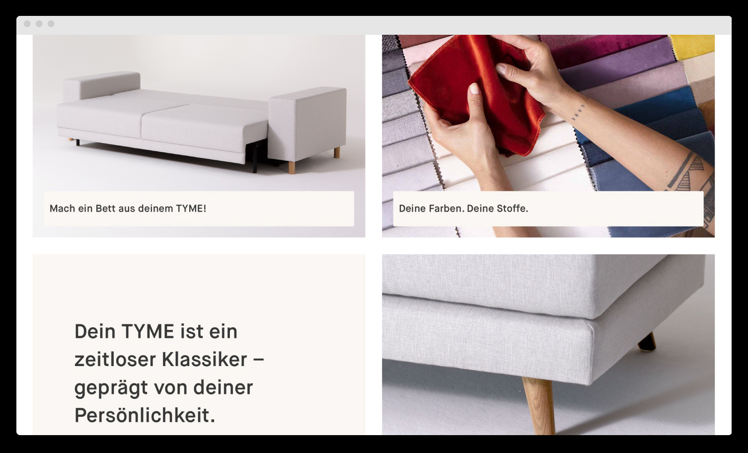
The proposal brings together our motivations and needs with the takeaways from the benchmark analyses.
- Re-grouped information unders easily scannable dropdowns to find in short hard facts about your product and our service.
-
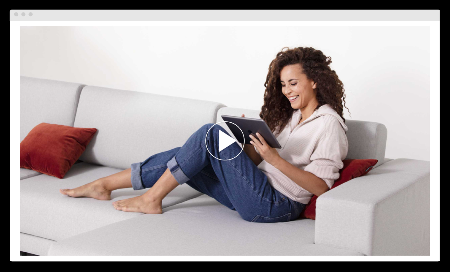
Video content to present our product lines and get a feel for what it looks like in real life.
-
Highlights visually the most important features that are customisable.
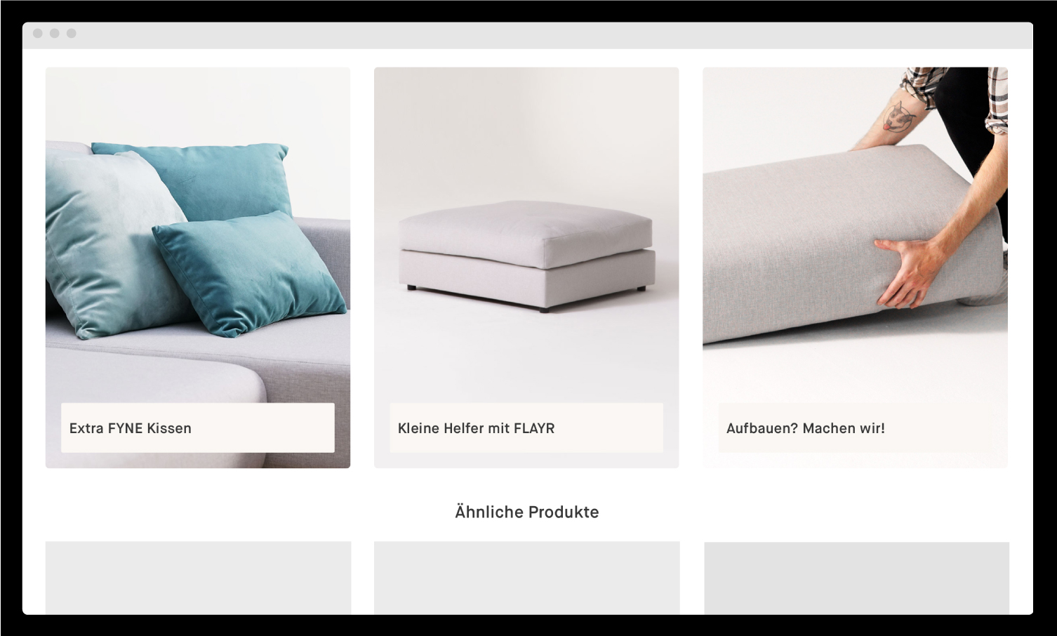
- Visually shows relevant services and other product lines.

Testing
Because the layout design but also the information architecture of the product details change quite radically I wanted to test whether the information would easily be found and make sure there wouldn’t be any major usability issues with the component.
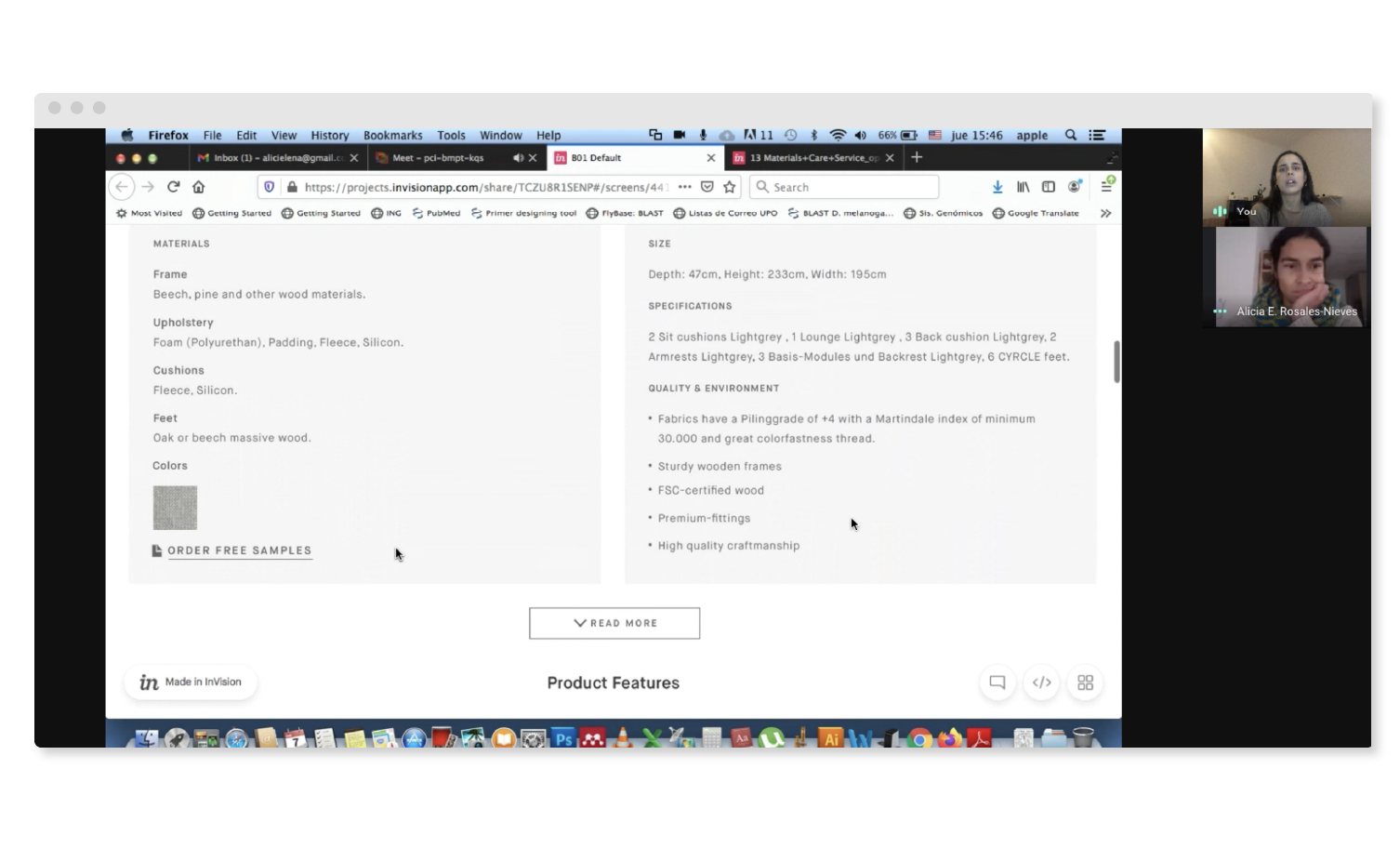
I conducted a Task Completion test with 5 friends and family with both designs on click-through prototypes built in InVision︎︎︎, ending up in a A/B test comparison.
A Task Completion or Navigation test, where I asked users to find 5 different types of information in both designs. With this test we can observe if the users are able to complete the tasks successfully without major complications and discover what some of those might be. We can also measure the time it takes them to complete such tasks and could compare if our proposed design is an improvement from the previous one.
Finding information - Speed
Design A (existing): Average time: 2:35.2
Design B (new): Average time: 2:12.8
Notes (Take with a grain of salt):
In design A the seat height was a trick question (the information is not there). However 3 of the 5 users thought I was just asking for the general height so they still found it.
4 users completed the task faster in the second variant since they had previous experience.
Only 1 didn’t because of the missing information on Design A.
Finding information - Insights
| Design A (existing) |
- Users liked the text hierarchy and how brief the information was on the product details.
- Has discoverability issues with the information hidden under “Read more”.
- Titles that were not technical made information finding difficult at times.
Design B (New)
- The information groups were easy to navigate but once open there was hesitation when scanning the information inside.
- Labels and what’s behind them can be revised (‘Service & payment’ instance).
- Revise brevity of copy.
Takeaways
- Users were able to find the information in our new design and there were no major issues.
- Information hierarchy within the accordions should be improved for fast scanning.
- Review label for ‘Service & Payment’.
- The new design is an improvement in discoverability of information.
Final design
After making some changes from the testing learnings the content team held a shoot to create the content for the live version that you can see on our website today. Visit this project live for the different sofa lines:
TYME︎︎︎
PYLLOW︎︎︎
FLAYR︎︎︎
We’re in the process of releasing this template in other product categories and lines.
To measure the project’s success we will monitor the use and engagement with the page’s content, the impact on conversions and the length in the decision-making phase.
We will also check with our Customer Care team to make sure that the amount of inquiries about product details have decreased since information is more accessible on the online experience.
During my time at MYCS I filled many roles and was able to work on projects across the entire website. The past year I’ve also led a small team of designers in doing user research, building solutions for making a more delightful experience when buying customisable furniture and supporting all the different business goals of the company like launching new product lines.
Not only did I work in designing different areas of the experience on their main shopping user journeys, but also in-depth in problem solving and interaction design on the MYCS configurator online tools. I organize roadmaps and processes for our team of designers and guide them through their personal career journeys.
I’ve highlighted this project to show the process. For more work you can visit their website︎︎︎